
Platform


Use your time for what really matters. Get started for free


Customers
Resources


Use your time for what really matters. Get started for free
Pricing
Say goodbye to errors in spreadsheets.
Use your time for what really matters.
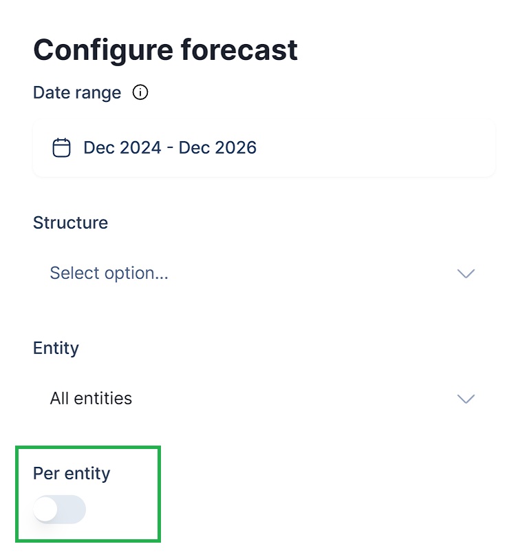
You can now enable an Entity column in your linked GSheet by using the "Per Entity" toggle. This means you can now forecast multiple entities simultaneously through the sheet integration as well.
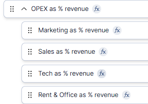
You can now also nest formulas in Structure. This way you can organize related formulas (they will not be summed or averaged).
Je kunt nu ook watervalgrafieken maken die de actuele resultaten vergelijken met een budget. Het budget wordt links weergegeven, de actuele resultaten rechts en het verschil wordt in het midden in groen of rood weergegeven. Voor de geselecteerde mapping(s) zie je duidelijk of je op budget ligt of achterloopt.
.png)
You can now create charts in Dashboard that compare a mapping across entities. You can also select multiple mappings by adding new series, and potentially stack them. The shown entities on the horizontal axis will correspond to the Entity filter set on the Dashboard level.
.png)
You can now run an additional export (in- or excluding GLAs) from the By Entity overview in Reporting that will display subtotals with their related eliminations and adjustments separately. Every parent identified in the Hierarchy in Setup > Sources will be treated as a sub consolidation.
.png)
No results found for your search query.
.png)

Consolidated reporting and forecasting.


.svg)
